The Hunger Site | 20 YEARS STRONG Campaign | Logo, landing page banners, emails & social media.
The Hunger Site 20th Anniversary.
This was a momentous occasion for The Hunger Site, a time to celebrate feeding orphans and food insecure families around the globe. A large scale advertising campaign that would span multiple platforms running all summer long.
Scroll ↓


The icon.
A colorful icon flanked by fireworks sets the festive mood. A bold serif anchors the icon and sans serif complete the dynamic duo needed to mark this celebration.
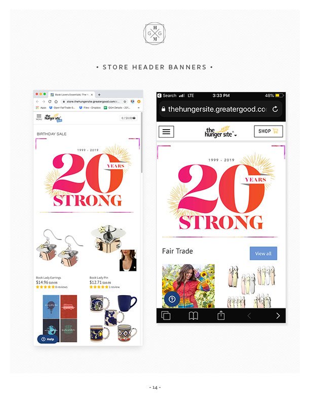
Landing Page Header Banner -1
The Hunger Site - Unabashed Bash - email.
Commercial Email Graphics, HTML & CSS.
Festive colors within a clean layout showcasing The Hunger Site Best Sellers.
Direct Donation Email Graphics, HTML & CSS.
The Hunger Site makes it possible to shares the joy of feeding those in need.
Social Media & Landing Page - Tile Template.
Social Media & Landing Page - Tile Template.
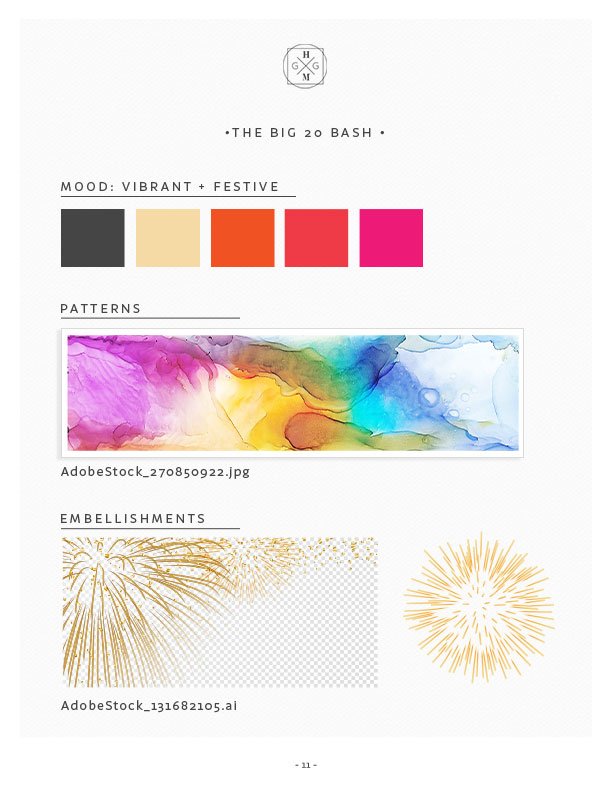
A suite of ads was created following the graphic standards, colors, layouts, typefaces, watercolor art rules, 20th anniversary icon and call to action buttons.
The template for in site ads and social media and would allow production to swap out model shots & product shots.
This streamlined production and created a cohesive message across all marketing and social media platforms.
Social Media & Landing Page - Model Tile Template.
Direct Donation Email Graphics, HTML & CSS.
To showcase the wonderful work The Hunger Site does, direct donation emails needed a bold and eye catching headline in bold festive serifs .
The FOOD RECOVERY NETWORK is one of the partners featured during this campaign, to emphasize the energy and joy of the volunteers in the program I made sure to break the grid and overlaid the anniversary icon to keep the eye moving.
The template allowed for body copy.
Using different weights of the same sans serif, the copy established hierarchy and makes for a quick read.
The warm festive colors of the Call To Action button, draw attention to themselves while the sans serif typeface gives you clear instructions to click & help.
Petition Email >>
To showcase the wonderful work The Hunger Site does, direct donation emails needed a bold and eye catching headline in bold festive serifs .
The FOOD RECOVERY NETWORK is one of the partners featured during this campaign, to emphasize the energy and joy of the volunteers in the program I made sure to break the grid and overlaid the anniversary icon to keep the eye moving.
The template allowed for body copy.
Using different weights of the same sans serif, the copy established hierarchy and makes for a quick read.
The warm festive colors of the Call To Action button, draw attention to themselves while the sans serif typeface gives you clear instructions to click & help.


